Redesign website
Overview
The project involved a comprehensive website redesign for the association, where I worked as a volunteer UX/UI designer at IT GIRLS. The main goal was to create a modern, intuitive, and user-friendly website that would not only serve as an attractive showcase but also effectively showcase the organization's activities. One of the main goals was to create a clear events section. The challenges included creating or improving the information architecture, streamlining navigation, and adapting the interface to the needs of various user groups.
As part of the project, I analyzed the existing website, designed new mockups, and created a new visual interface, ensuring visual consistency, clarity of content, and meeting the client's requirements. Improving accessibility and responsiveness to ensure user experience across devices was also a key aspect of the redesign. The end result is a functional and visually appealing platform that supports the association's communication and more effectively engages users.
The website redesign project utilized design sprint methodology to streamline the decision-making process and quickly validate the direction of changes. Initially, we focused on understanding the needs of both the association and its users. We analyzed the existing website, identified key issues, and defined business goals. We then moved on to the conceptual stage, where we developed several concepts for a new website structure and visual design. After team discussions, we selected the most promising solutions that met both user needs and the organization's goals. The next step was to create a prototype that reflected key functionalities and content layout. The prototype was tested, allowing us to quickly gather feedback and make necessary improvements before implementation. Through this process, we minimized the risk of poor design decisions and created a solution that better met user needs.


Categories
Redesign website
UX/UI Desinger
Date
Client
PMI Silesia Branch | IT Girls

Core Problem Statement
Visitors to the PMI Silesia website struggle to understand the organization's offerings and cannot easily find relevant information because the site lacks a clear hierarchy, visual cues, and purposeful content structure. This results in low engagement, skipped event registrations, and a poor first impression that undermines the organization's professional credibility.
Research & Discovery
The research phase was structured around individual competitive analysis conducted by each designer on the team. Rather than formal user interviews or usability testing, our process focused on gathering design inspiration and identifying best practices from comparable organizations — other PMI chapters, professional associations, and conference-oriented websites — to inform aesthetic and structural decisions.
The primary design brief was provided directly by PMI Silesia Branch, which established the key constraints and expectations for the project. Work was coordinated by a PMI Manager, which streamlined decision-making and reduced the need for additional stakeholder research rounds. This allowed the team to move quickly from discovery into ideation while staying aligned with the client's vision.
Define & Strategy
Problem statement:
The PMI Silesia website needed a modern, intuitive redesign that would feel conference-grade, build brand recognition, and establish a coherent visual identity as part of the broader PMI brand
Design goals:
Create a visually distinctive site that communicates professionalism and credibility at first glance
Build intuitive navigation that requires no learning curve
Align the design with PMI global brand guidelines while giving the Silesia chapter its own identity
Improve SEO structure to increase organic discoverability
Success criteria:
Improved search engine visibility through semantic HTML structure and content hierarchy
Positive reception from the client during prototype review
Reduced visual clutter measured against the original site's heuristic evaluation findings
Ideation & Design Process
The wireframing phase was built around Design Thinking methodology. The team of designers split responsibilities by section — each designer prepared three lo-fi variants of their assigned areas, working within a shared set of visual and structural principles agreed upon upfront.
Decisions were made collaboratively through dot voting sessions, structured discussions, and open brainstorming. The team met twice a week, and sessions regularly extended late into the evening — a reflection of genuine engagement with the work. Between meetings, design decisions continued to evolve asynchronously through Figma's comment system and a dedicated Slack group, keeping momentum and alignment consistent throughout.
Among the most discussed elements were: a countdown timer to upcoming events, unified tagging conventions, micro-interactions, and content descriptions. These details might seem minor, but they directly shaped how the final product would feel to use.
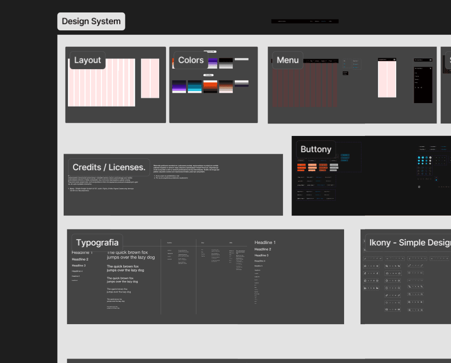
Simultaneously, the team built a comprehensive design system — covering not just colors, typography, icons, buttons, and inputs, but also navigation components, subpage layouts, and accordion patterns. This ensured consistency across all screens and gave developers a structured handoff.
Final Design
The final designs were compiled into a high-fidelity prototype covering all key screens and user flows. This prototype was presented to the primary stakeholder — the PMI Silesia client — as the main deliverable, enabling them to experience the redesigned product before development began.

Testing & Validation
Validation was conducted through informal usability testing — the prototype was shown to a small group of trusted contacts, providing quick but meaningful feedback. The sessions surfaced several areas for improvement, most notably around the clarity of event agenda layouts and visual hierarchy across specific sections. These insights were incorporated before the final handoff.
Results & Impact
Validation was conducted through informal usability testing — the prototype was shown to a small group of trusted contacts, providing quick but meaningful feedback. The sessions surfaced several areas for improvement, most notably around the clarity of event agenda layouts and visual hierarchy across specific sections. These insights were incorporated before the final handoff.
Reflections
This project was, above all, a lesson in collaboration and feedback culture. Working in a team of designers — each with their own approach and creative instincts — required constant communication, transparency, and a lot of patience.
Looking back, I'd invest more intentionally in the facilitation side of the process. Structured workshops for the design team itself — not just stakeholder sessions — could help sustain engagement over a long project, ensure everyone feels heard, and prevent creative fatigue or unintentional favoritism in decision-making.
On a technical level, this project pushed me to sharpen my Figma skills significantly. The scale and complexity of the design system we built motivated me to work faster and more precisely — a habit I've carried into every project since.
Redesign website
Overview
The project involved a comprehensive website redesign for the association, where I worked as a volunteer UX/UI designer at IT GIRLS. The main goal was to create a modern, intuitive, and user-friendly website that would not only serve as an attractive showcase but also effectively showcase the organization's activities. One of the main goals was to create a clear events section. The challenges included creating or improving the information architecture, streamlining navigation, and adapting the interface to the needs of various user groups.
As part of the project, I analyzed the existing website, designed new mockups, and created a new visual interface, ensuring visual consistency, clarity of content, and meeting the client's requirements. Improving accessibility and responsiveness to ensure user experience across devices was also a key aspect of the redesign. The end result is a functional and visually appealing platform that supports the association's communication and more effectively engages users.
The website redesign project utilized design sprint methodology to streamline the decision-making process and quickly validate the direction of changes. Initially, we focused on understanding the needs of both the association and its users. We analyzed the existing website, identified key issues, and defined business goals. We then moved on to the conceptual stage, where we developed several concepts for a new website structure and visual design. After team discussions, we selected the most promising solutions that met both user needs and the organization's goals. The next step was to create a prototype that reflected key functionalities and content layout. The prototype was tested, allowing us to quickly gather feedback and make necessary improvements before implementation. Through this process, we minimized the risk of poor design decisions and created a solution that better met user needs.
Categories
Redesign website
UX/UI Desinger
Date
Client
PMI Silesia Branch | IT Girls
Core Problem Statement
Visitors to the PMI Silesia website struggle to understand the organization's offerings and cannot easily find relevant information because the site lacks a clear hierarchy, visual cues, and purposeful content structure. This results in low engagement, skipped event registrations, and a poor first impression that undermines the organization's professional credibility.
Research & Discovery
The research phase was structured around individual competitive analysis conducted by each designer on the team. Rather than formal user interviews or usability testing, our process focused on gathering design inspiration and identifying best practices from comparable organizations — other PMI chapters, professional associations, and conference-oriented websites — to inform aesthetic and structural decisions.
The primary design brief was provided directly by PMI Silesia Branch, which established the key constraints and expectations for the project. Work was coordinated by a PMI Manager, which streamlined decision-making and reduced the need for additional stakeholder research rounds. This allowed the team to move quickly from discovery into ideation while staying aligned with the client's vision.
Define & Strategy
Problem statement:
The PMI Silesia website needed a modern, intuitive redesign that would feel conference-grade, build brand recognition, and establish a coherent visual identity as part of the broader PMI brand
Design goals:
Create a visually distinctive site that communicates professionalism and credibility at first glance
Build intuitive navigation that requires no learning curve
Align the design with PMI global brand guidelines while giving the Silesia chapter its own identity
Improve SEO structure to increase organic discoverability
Success criteria:
Improved search engine visibility through semantic HTML structure and content hierarchy
Positive reception from the client during prototype review
Reduced visual clutter measured against the original site's heuristic evaluation findings
Ideation & Design Process
The wireframing phase was built around Design Thinking methodology. The team of designers split responsibilities by section — each designer prepared three lo-fi variants of their assigned areas, working within a shared set of visual and structural principles agreed upon upfront.
Decisions were made collaboratively through dot voting sessions, structured discussions, and open brainstorming. The team met twice a week, and sessions regularly extended late into the evening — a reflection of genuine engagement with the work. Between meetings, design decisions continued to evolve asynchronously through Figma's comment system and a dedicated Slack group, keeping momentum and alignment consistent throughout.
Among the most discussed elements were: a countdown timer to upcoming events, unified tagging conventions, micro-interactions, and content descriptions. These details might seem minor, but they directly shaped how the final product would feel to use.
Simultaneously, the team built a comprehensive design system — covering not just colors, typography, icons, buttons, and inputs, but also navigation components, subpage layouts, and accordion patterns. This ensured consistency across all screens and gave developers a structured handoff.
Final Design
The final designs were compiled into a high-fidelity prototype covering all key screens and user flows. This prototype was presented to the primary stakeholder — the PMI Silesia client — as the main deliverable, enabling them to experience the redesigned product before development began.
Testing & Validation
Validation was conducted through informal usability testing — the prototype was shown to a small group of trusted contacts, providing quick but meaningful feedback. The sessions surfaced several areas for improvement, most notably around the clarity of event agenda layouts and visual hierarchy across specific sections. These insights were incorporated before the final handoff.
Results & Impact
Validation was conducted through informal usability testing — the prototype was shown to a small group of trusted contacts, providing quick but meaningful feedback. The sessions surfaced several areas for improvement, most notably around the clarity of event agenda layouts and visual hierarchy across specific sections. These insights were incorporated before the final handoff.
Reflections
This project was, above all, a lesson in collaboration and feedback culture. Working in a team of designers — each with their own approach and creative instincts — required constant communication, transparency, and a lot of patience.
Looking back, I'd invest more intentionally in the facilitation side of the process. Structured workshops for the design team itself — not just stakeholder sessions — could help sustain engagement over a long project, ensure everyone feels heard, and prevent creative fatigue or unintentional favoritism in decision-making.
On a technical level, this project pushed me to sharpen my Figma skills significantly. The scale and complexity of the design system we built motivated me to work faster and more precisely — a habit I've carried into every project since.



Book a call, and I’ll take care of the rest
Book a call, and I’ll take care of the rest
Book a call, and I’ll take care of the rest